Monthly Mean Temperatures
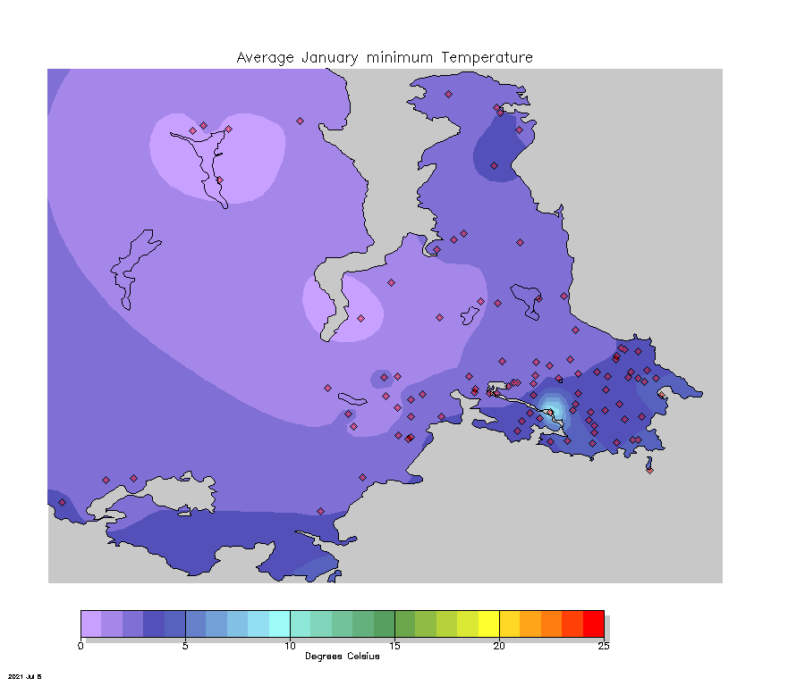
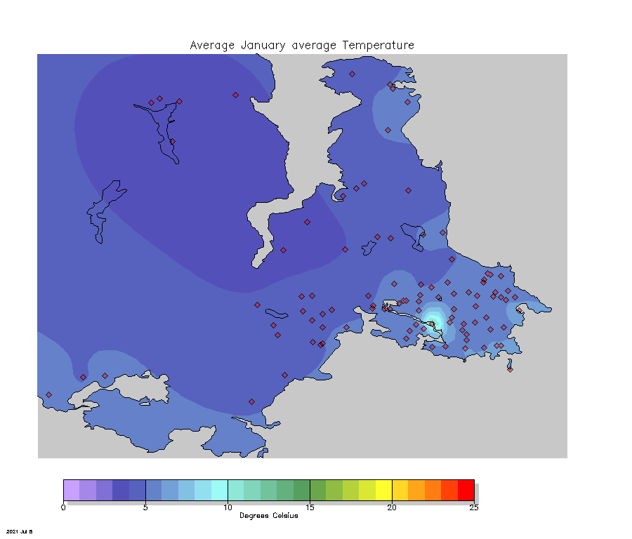
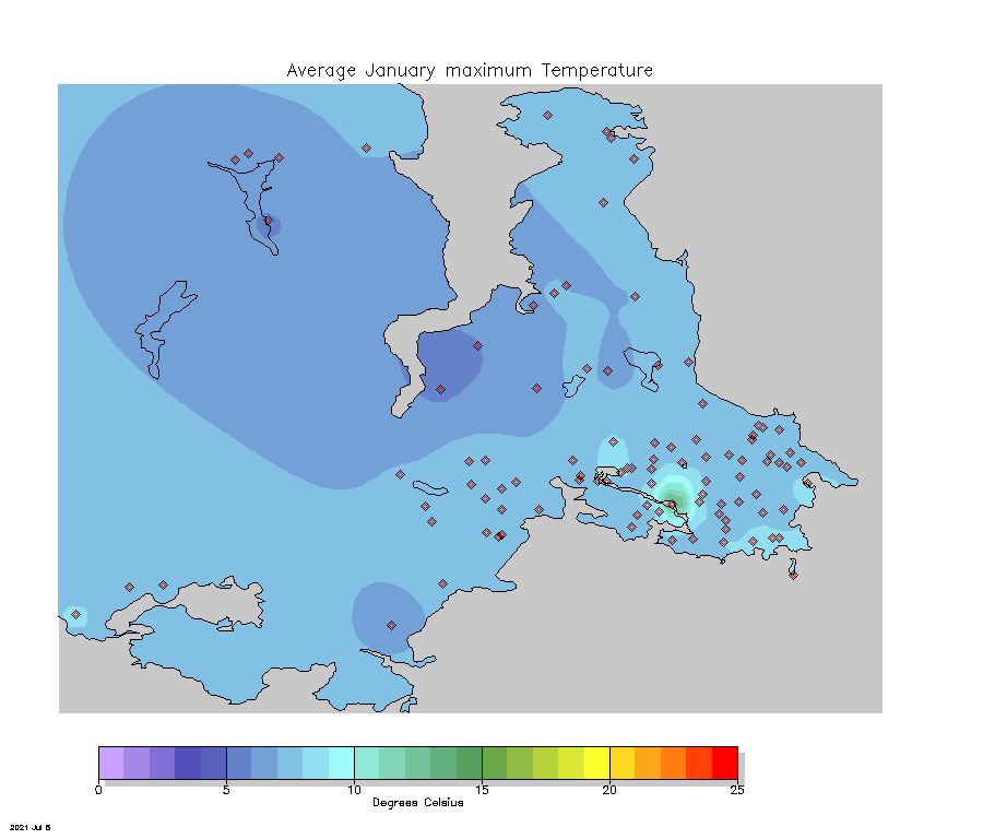
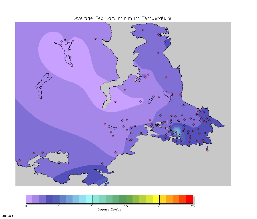
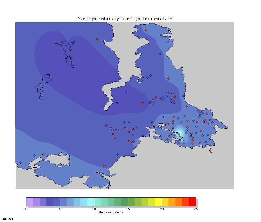
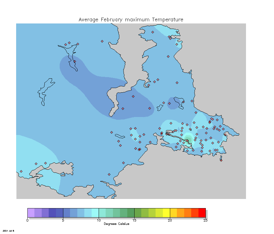
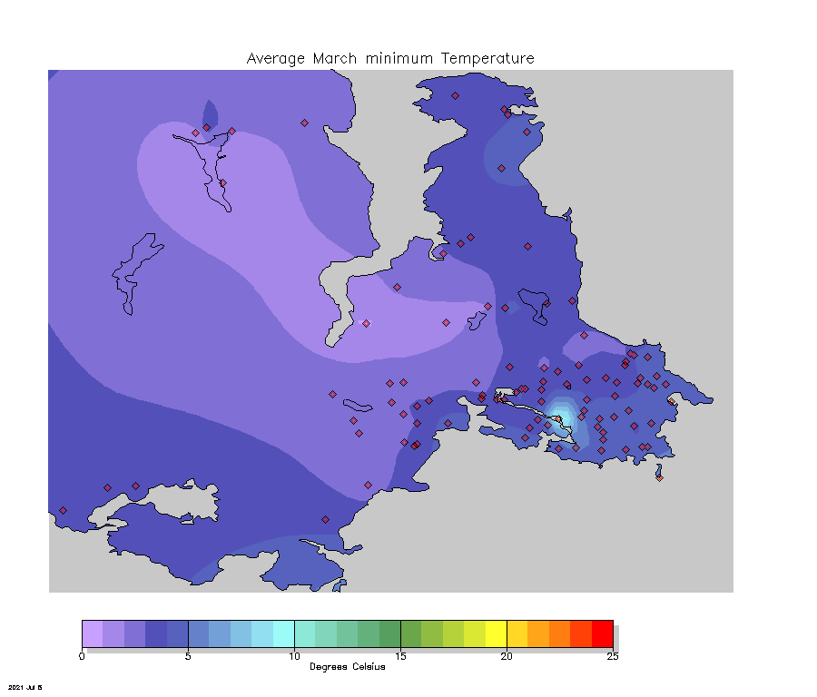
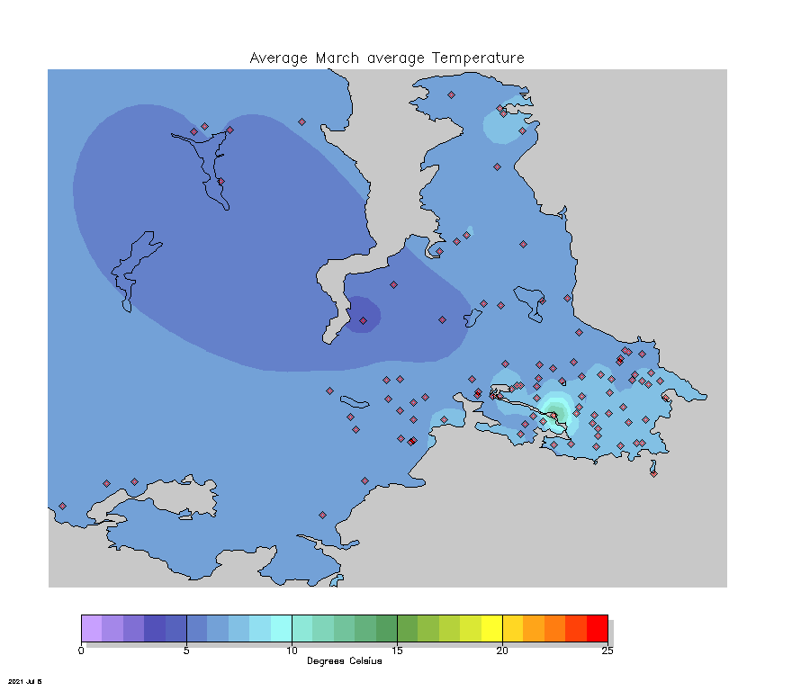
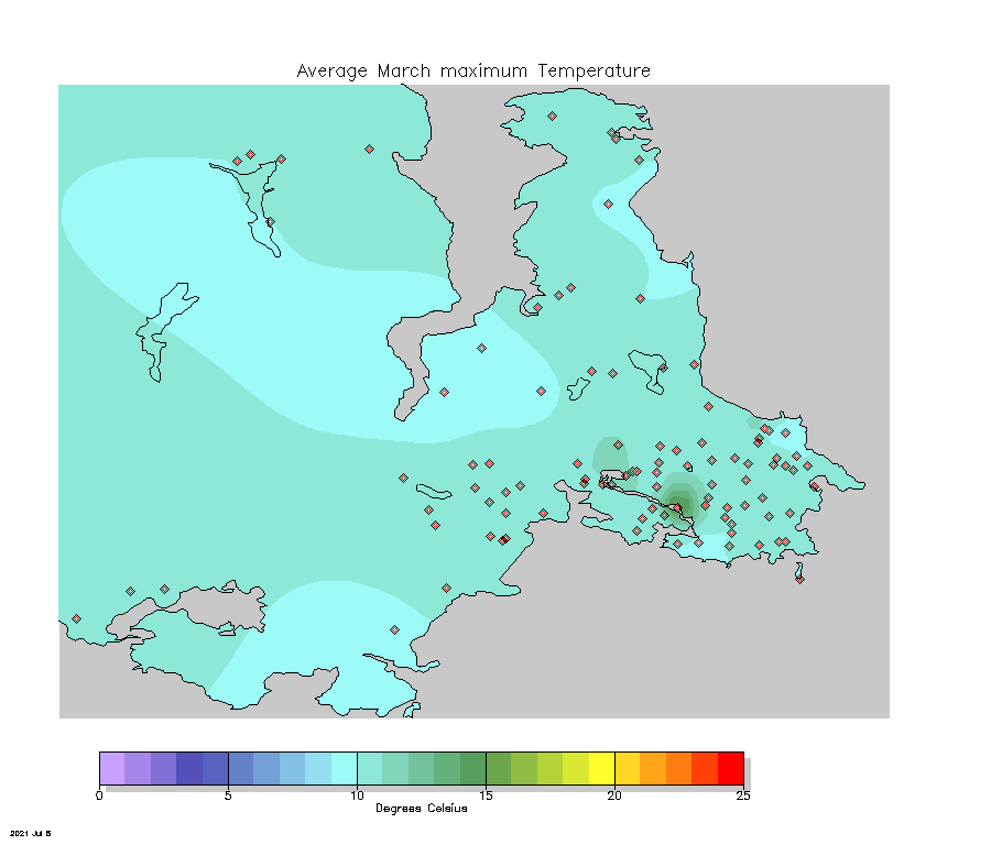
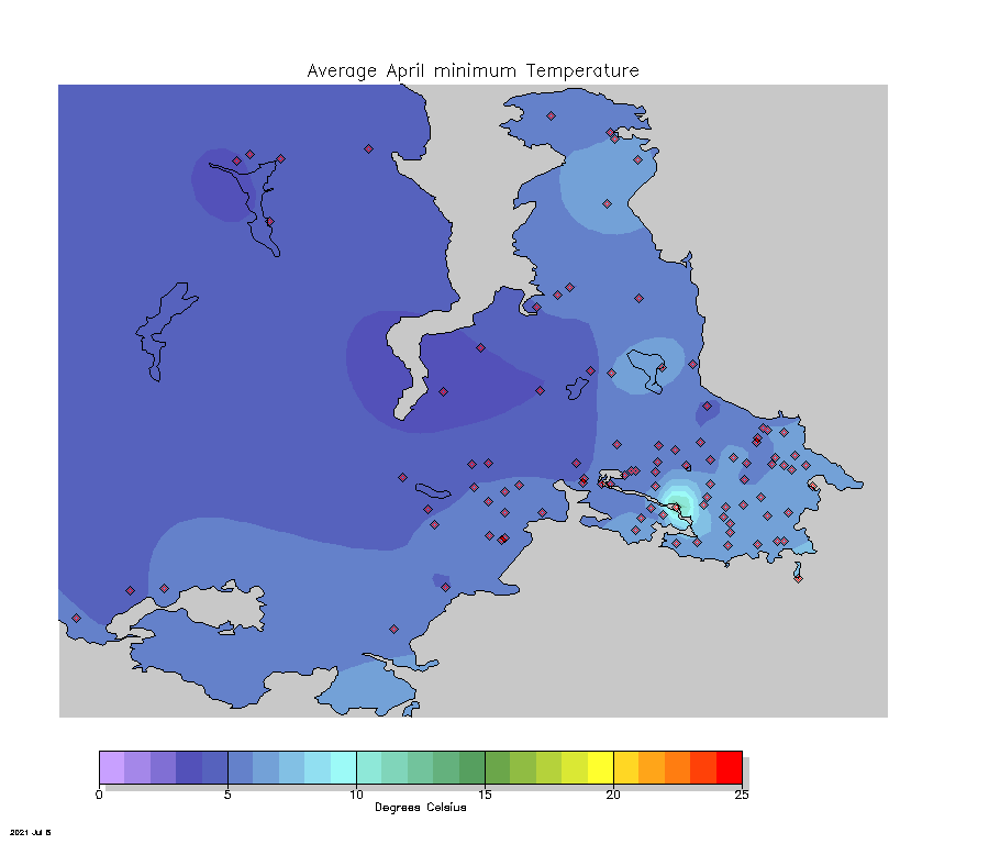
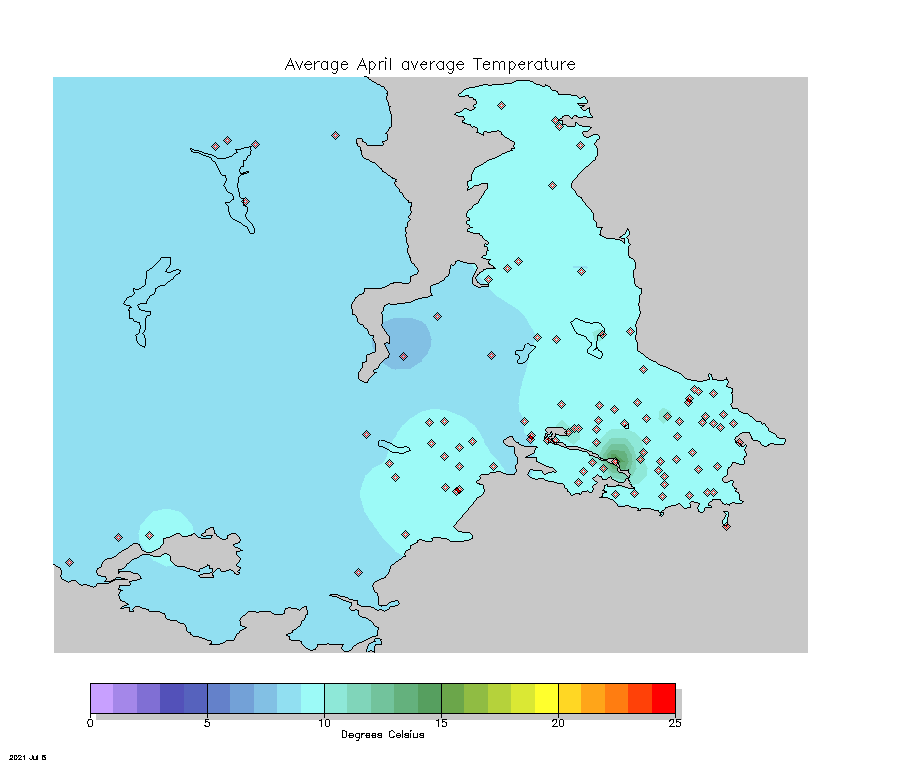
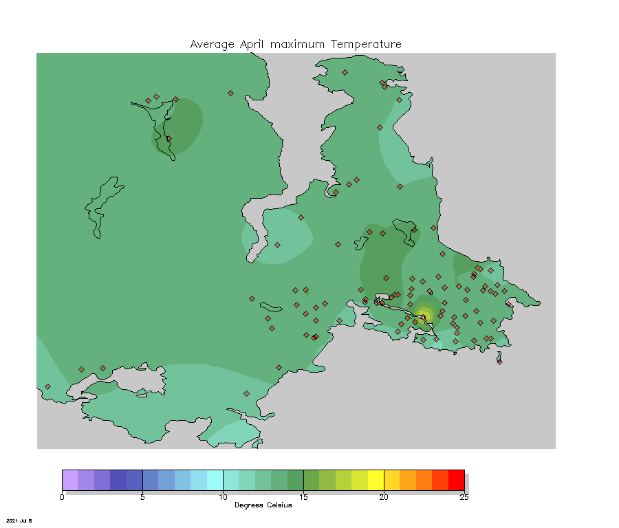
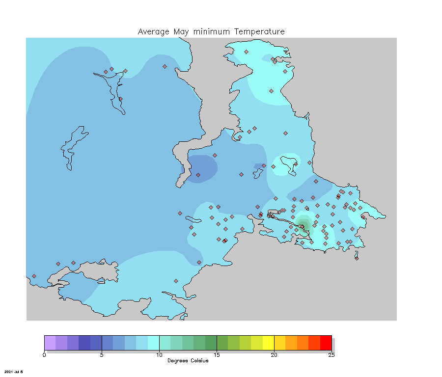
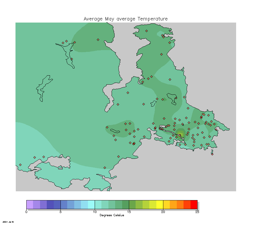
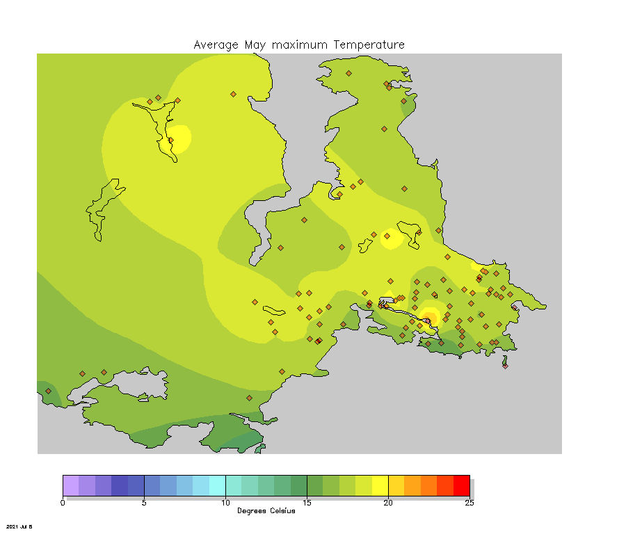
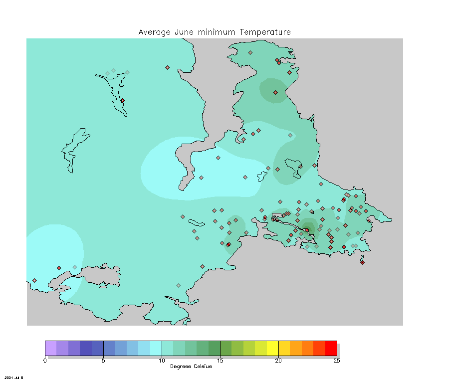
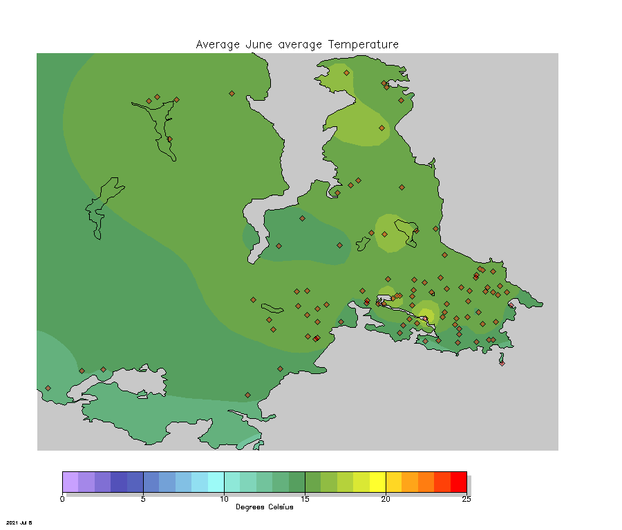
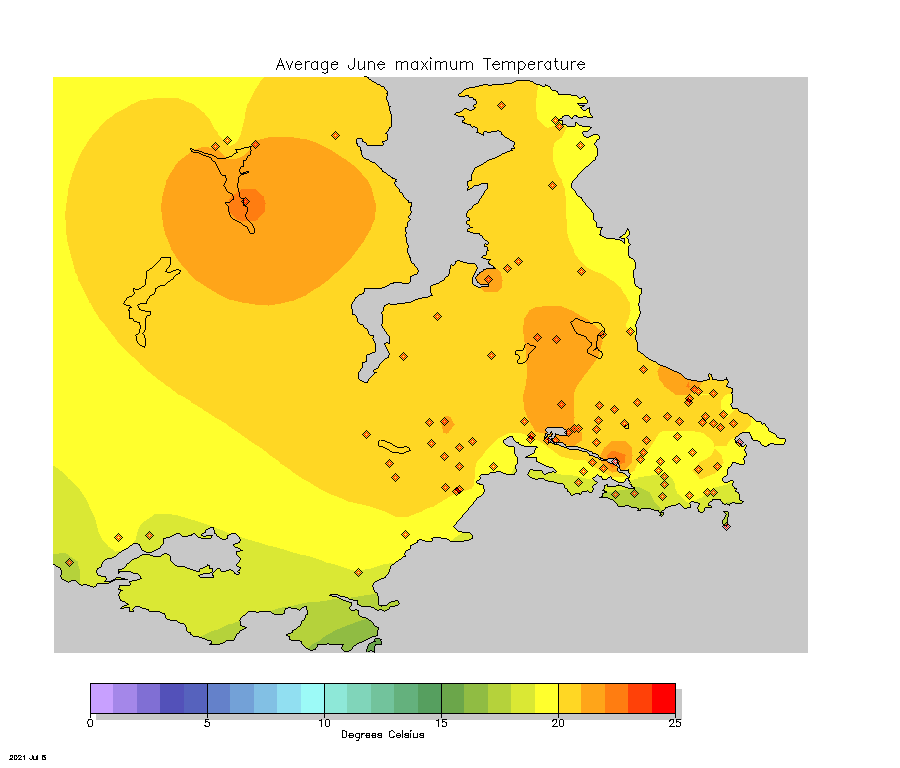
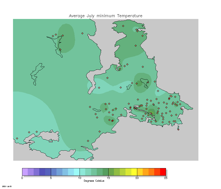
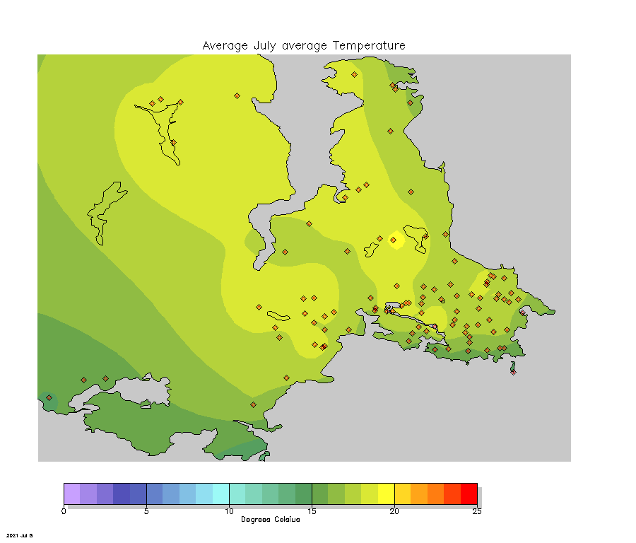
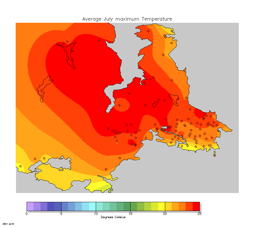
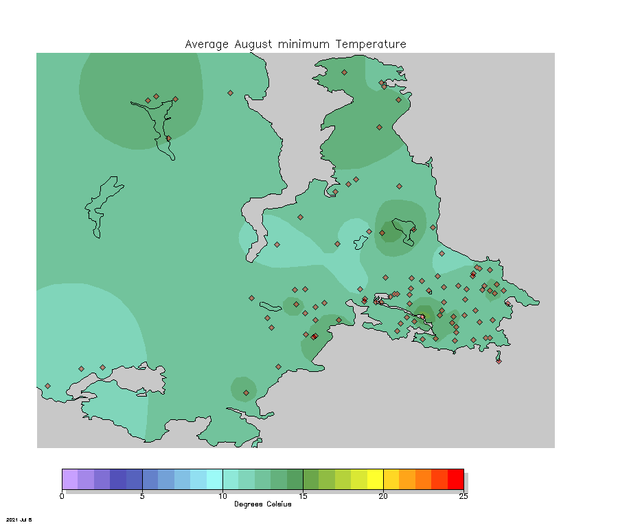
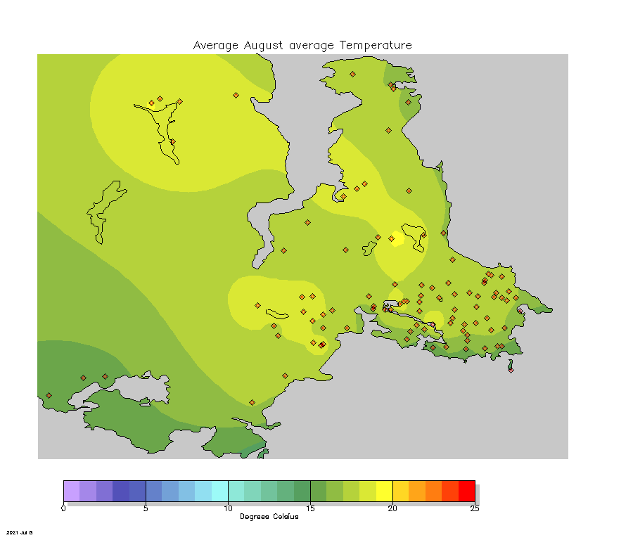
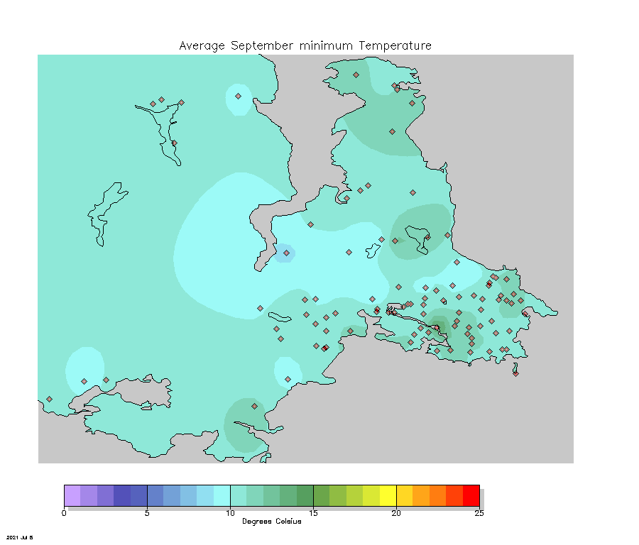
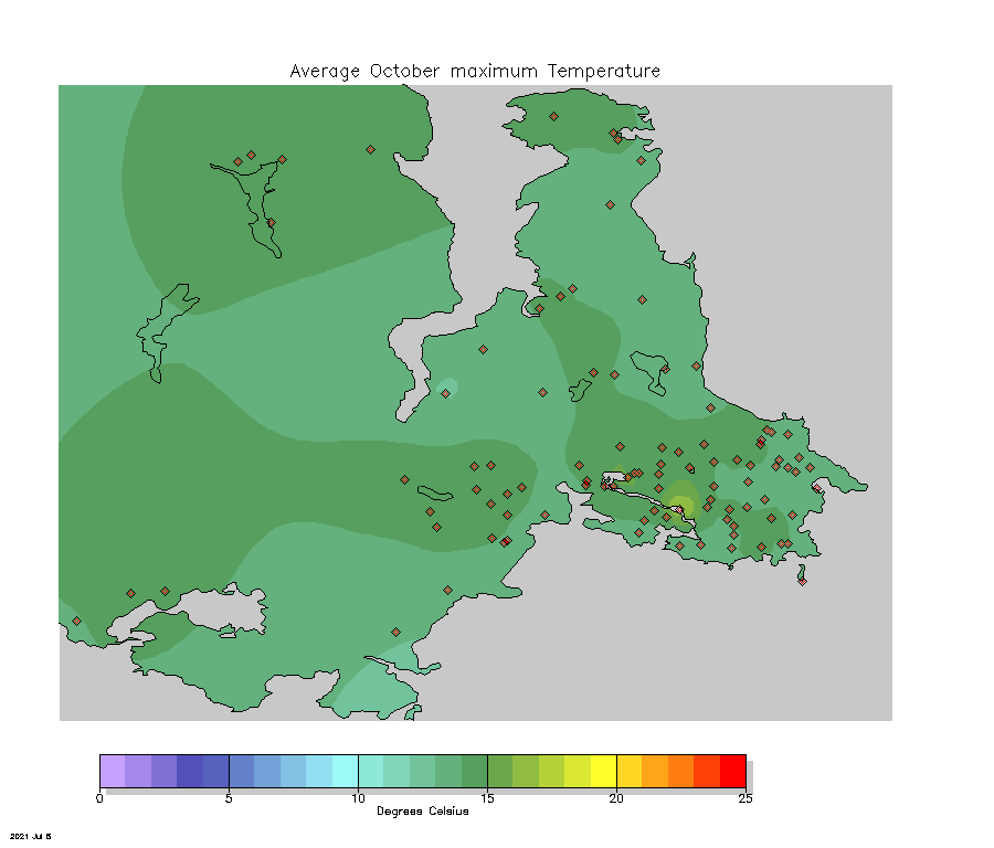
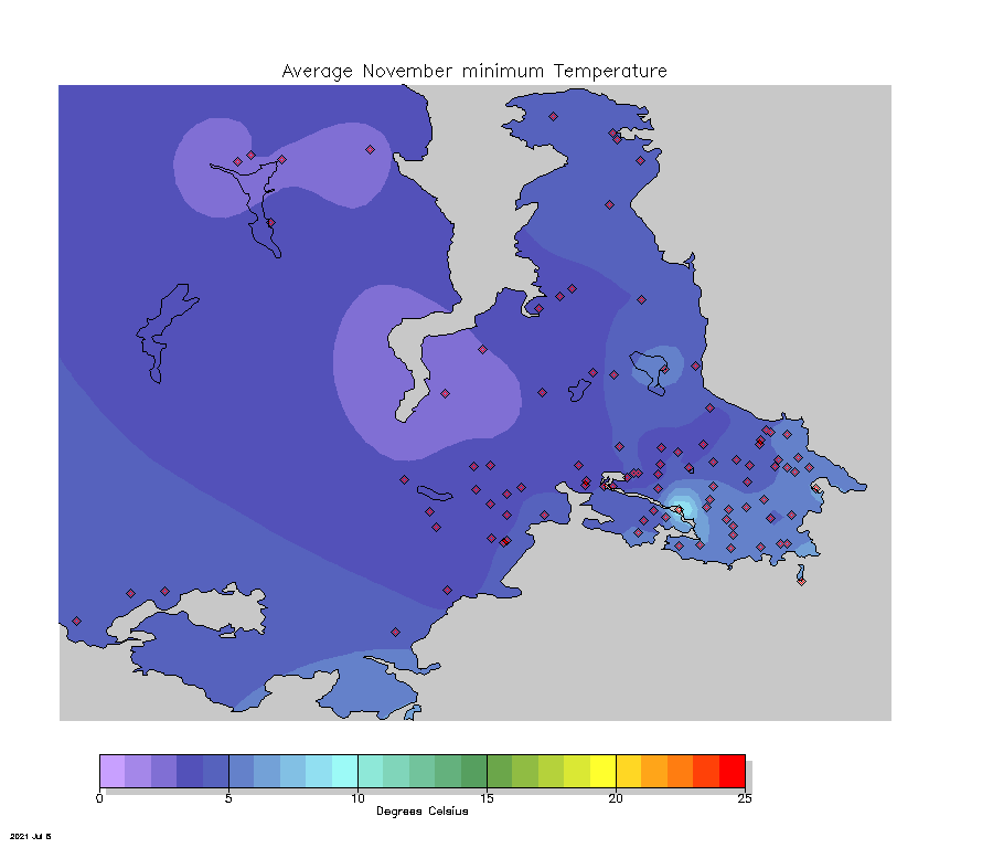
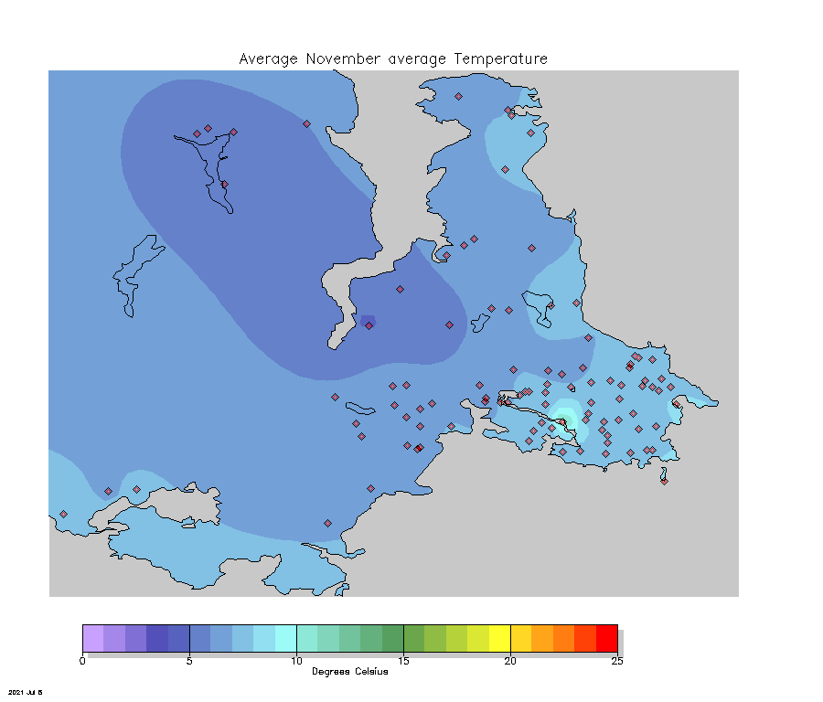
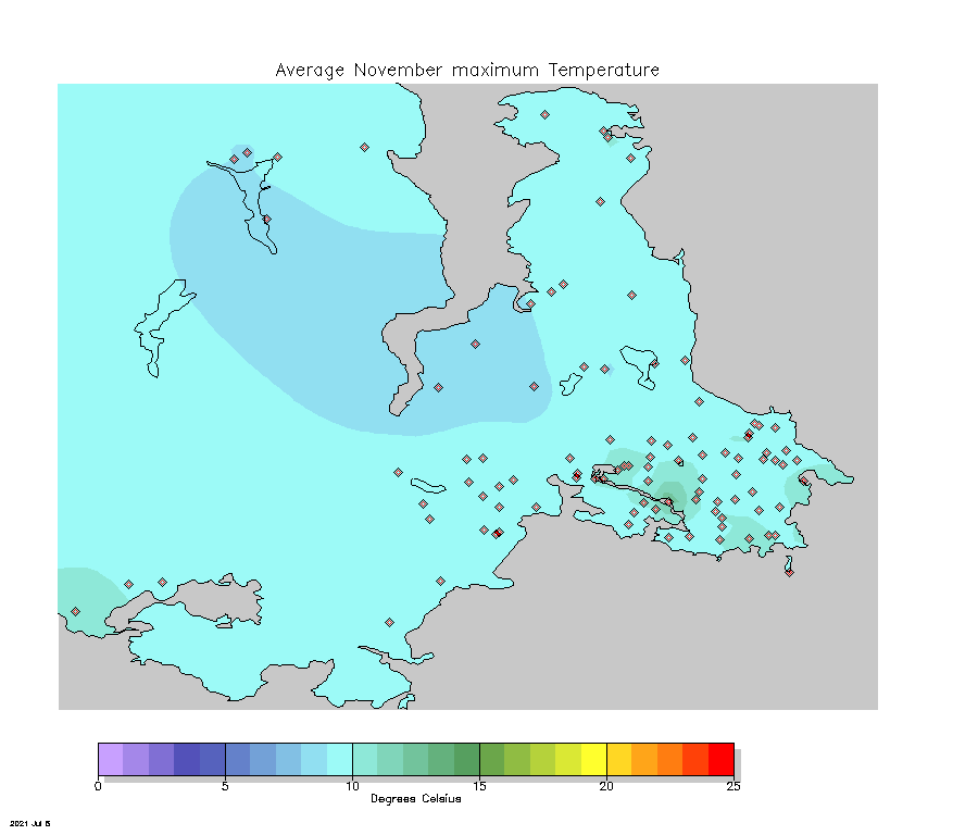
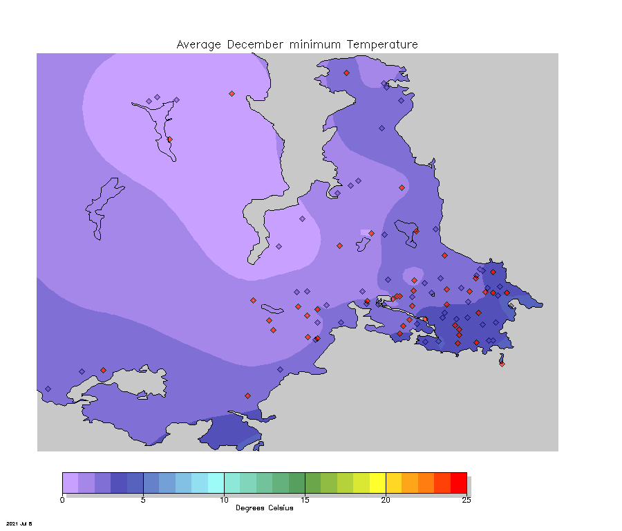
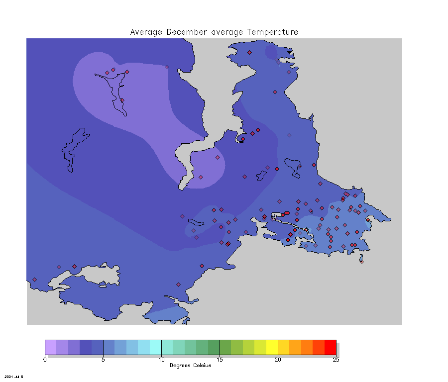
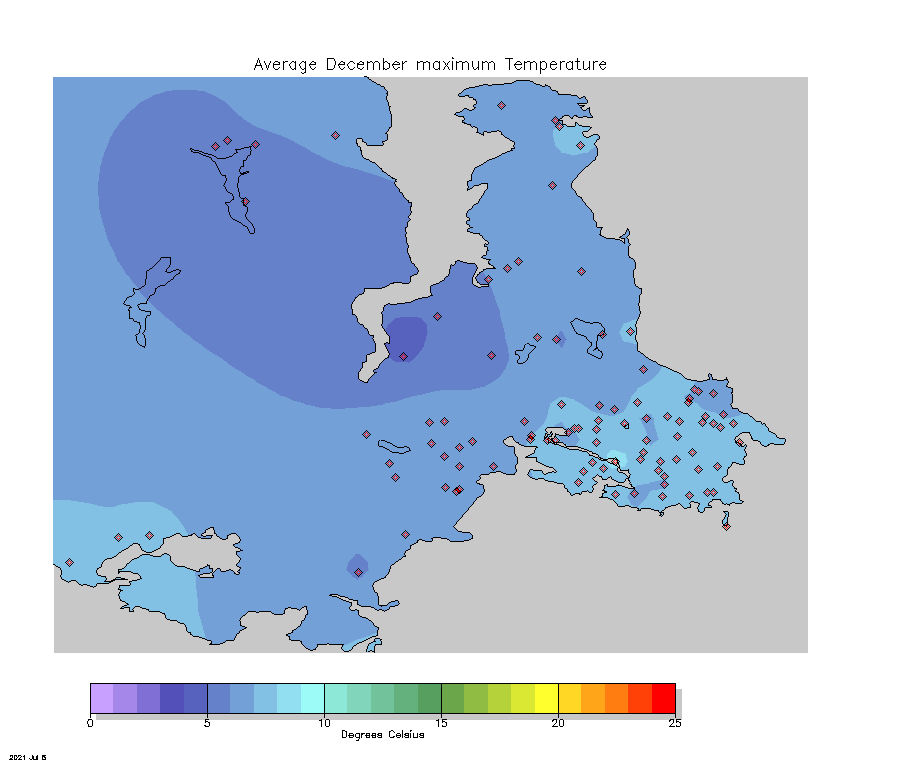
We've combined daily minimum, average, and maximum temperatures for each month of the year into monthly mean values at each station in the network. The number of values available at each station varies according to how long the station has been available since installation. We then take these values and calculate best-fit interpolated values between them (using a method called kriging) and draw contours along equal values. The contours are represented here by filling them with colours according to a predefined range of values at intervals of a distinct colour for each change of one degree Celsius. These maps will slowly change as more observations are collected in coming years.
Click on an image that you'd like to see and a larger version will load. Click on the image again to return to the table.
| Average | ||
|---|---|---|
| Minimum | Average | Maximum |
|
|
|
|
|
|
|
|
|
|
|
|
|
|
|
|
|
|
|
|
|
|
|

|
|
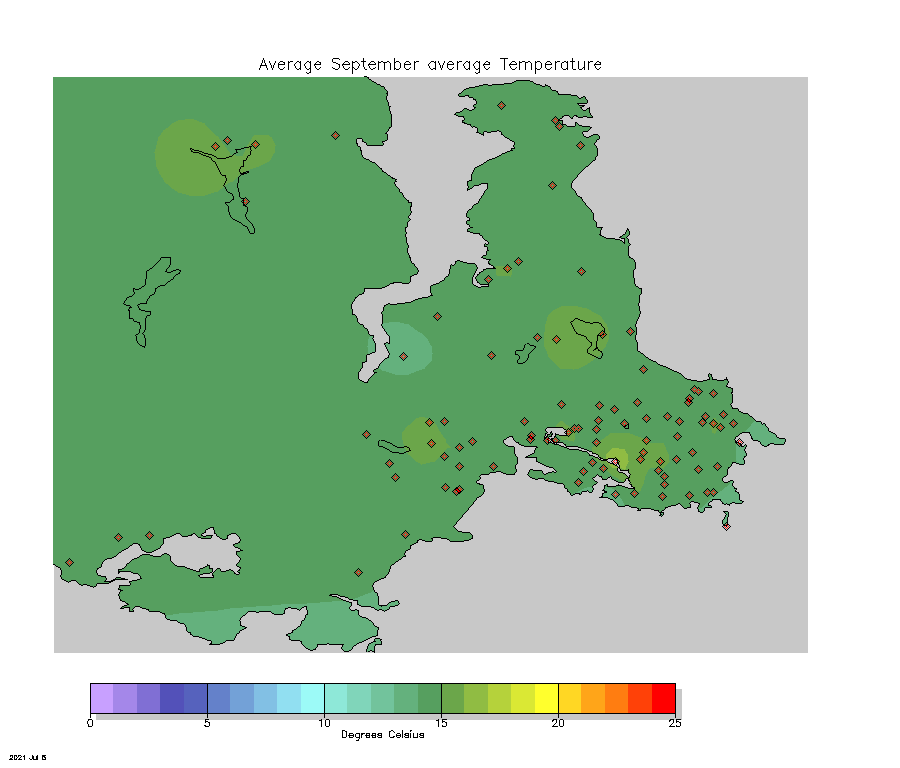
|
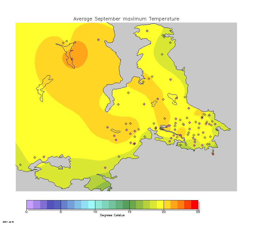
|
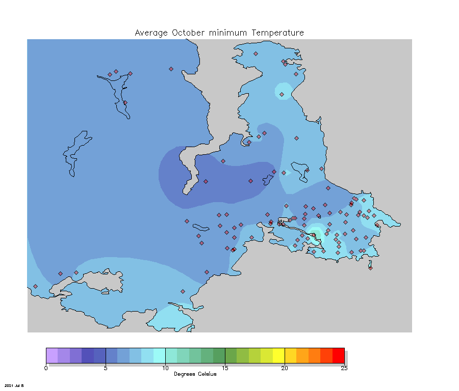
|
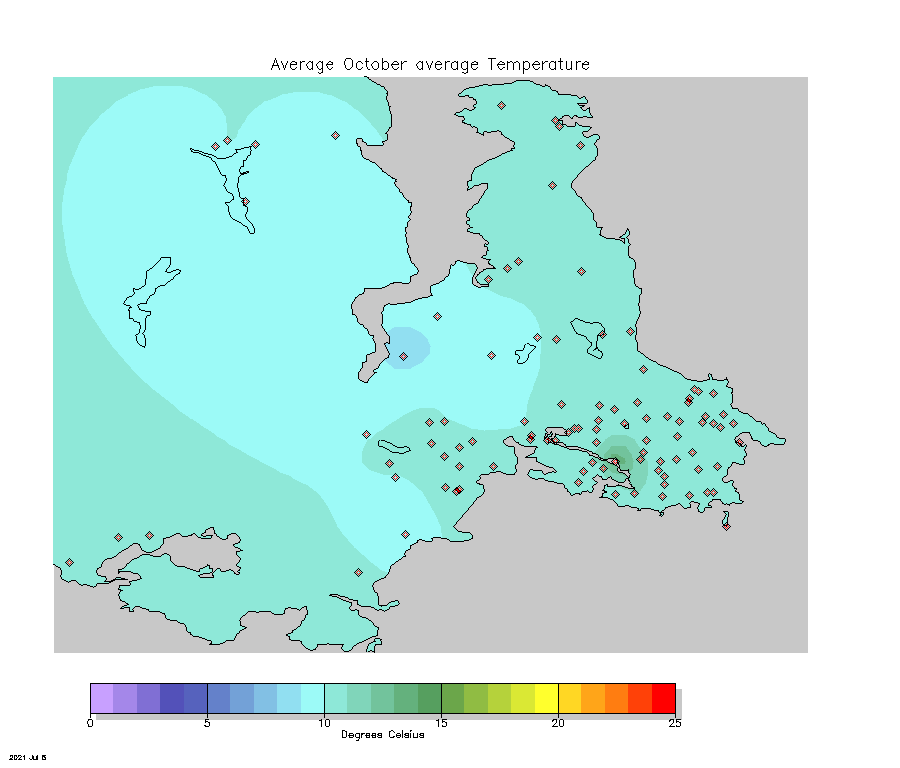
|
|
|
|
|
|
|
|

