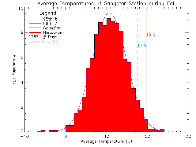
Histograms of Average Temperature
Sangster Elementary School
See below for more information.
Description
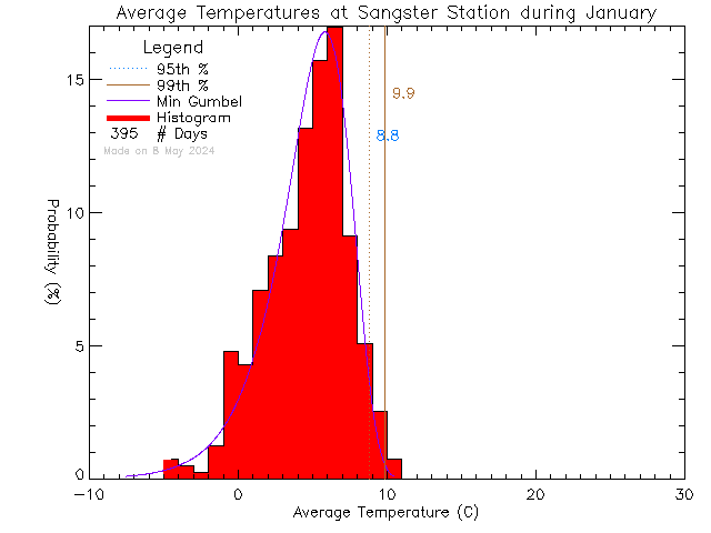
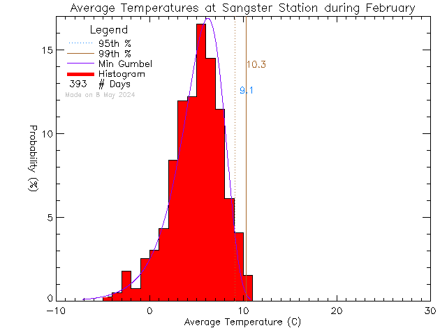
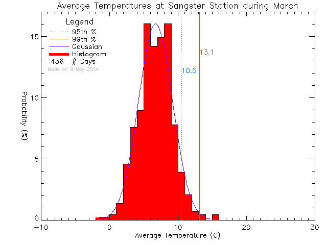
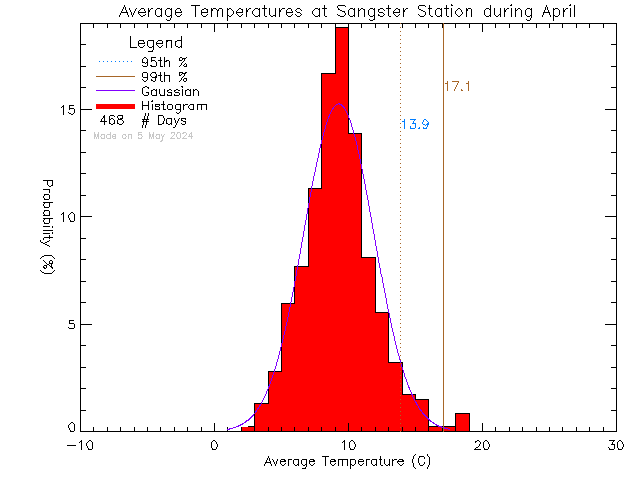
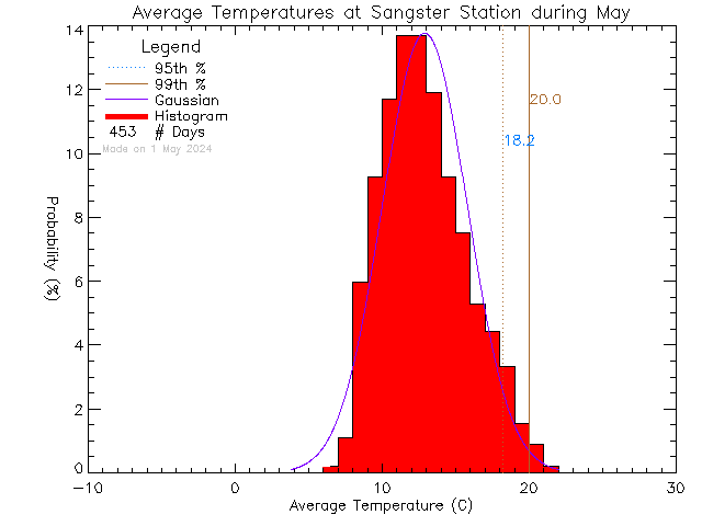
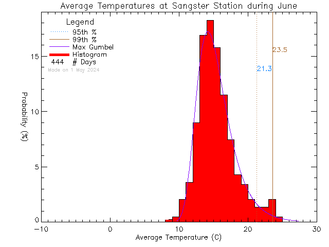
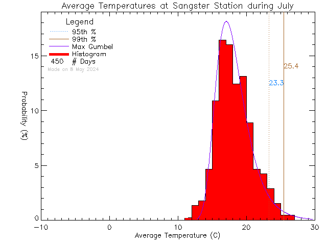
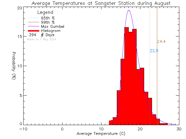
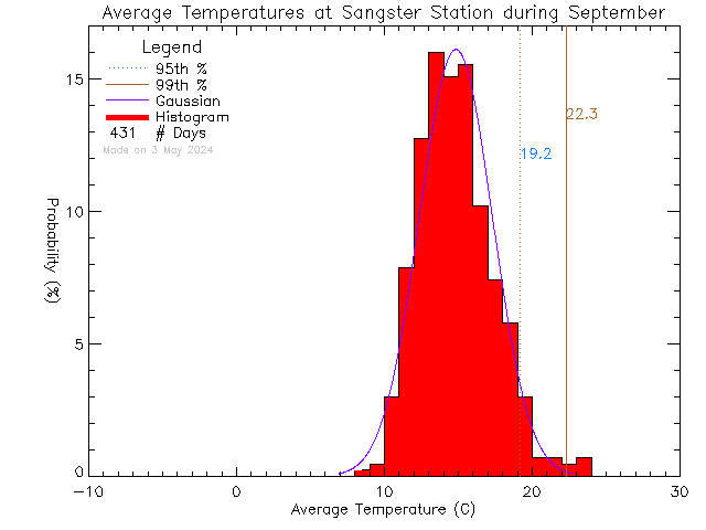
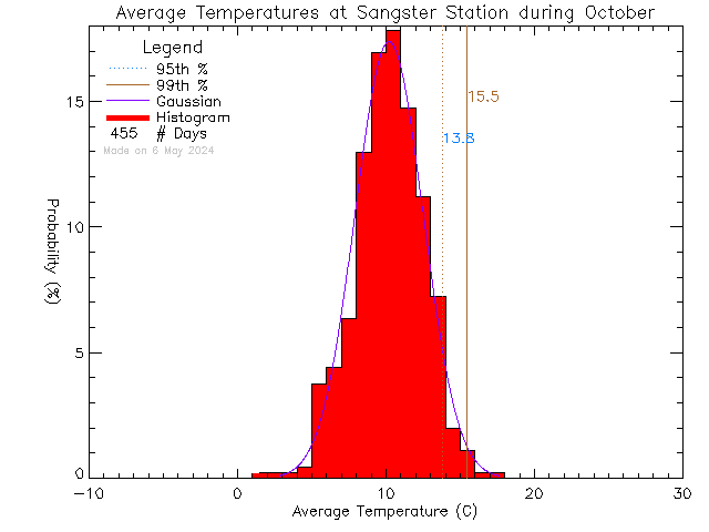
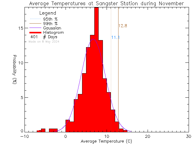
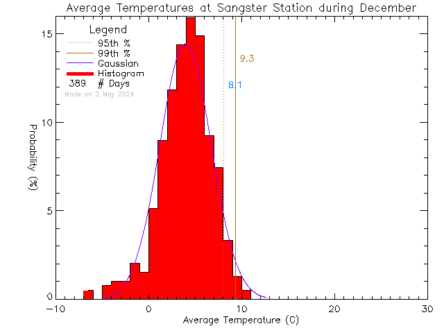
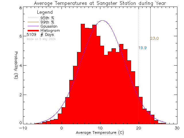
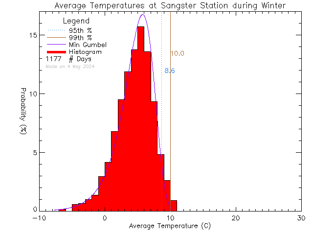
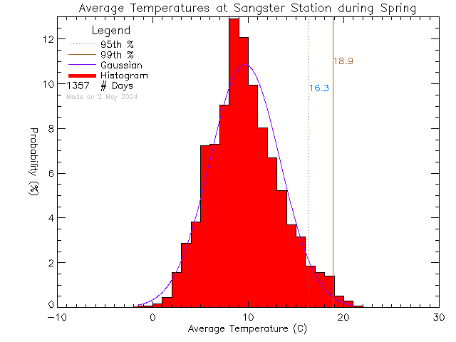
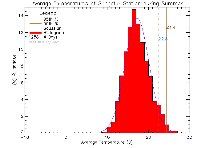
These plots show Probability Density Functions (PDFs) of daily average temperature at stations in the UVic School-Based Weather Station Network. The vertical red bars show a histogram of daily average temperatures. The data is fitted to one of three different probability distribution functions (Maximum or Minimum Gumbel and Gaussian), shown with a blue curve. The Gumbel distributions are appropriate for fitting sets of extreme values .e.g the set of maximum temperatures. We select the fit function with the least error.
The plots are shown for the entire year and for each season. We use the Meteorological Seasons, defined as follows:
- Winter — DJF: December, January, February
- Spring — MAM: March, April, May
- Summer — JJA: June, July, August
- Autumn — SON: September, October, November
Individual Months Are Shown Below
